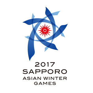

The overall form of the logo represents Hokkaido - the northernmost of Japan's four main islands - as a whole. It also has design elements echoing the North Star shining in the night sky, a snow crystal and the winter breeze. The blue of the outer arcs symbolizes the chill of winter, while the bright sun (the symbol of the OCA) represents the fiery passion with which the Games will be contested regardless of the bracing winter conditions.
The five blue arcs represent the five sports of the Games (skiing, skating, ice hockey, curling and biathlon), and are inspired by the speed and energy with which the athletes will compete. The arcs also hold extra significance, representing the people from the five zones of Asia (West, Central, South, South East and East) who will assemble in the host cities of Sapporo and Obihiro and work together to ensure the success of the Games.
Although the arcs seem to gravitate toward the centre, they can also be viewed as spreading outward, representing our hopes that the influence of this winter sporting event will develop and spread with Hokkaido as a base.


